For the past couple of weeks, I have been playing around with sage-green lopi yarn/roving that my friend brought back from Iceland (see earlier post It’s raining icelanding sheep!). I want to knit up some gloves with all three colors of roving that I have and after some experimentation, I decided to blend the icelandic greens with alpaca to make them softer. My other option was to knit the gloves and then knit an inner liner to make them less scatchy so I decided not to go that route.
The first task was to dye up some alpaca to match the sage green Icelandic lopi:

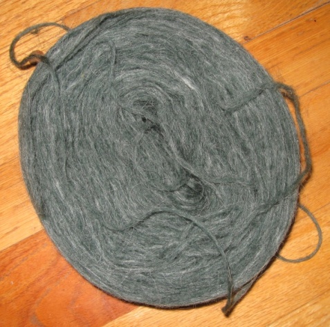
Sage-green lopi
The alpaca I had sitting around was an off-white butter color, but I thought I’d give it a shot. First I tried to use the color sample book that I have for Mother MacKenzie’s dyes, but the two colors I thought looked closest didn’t work at all. This is when I began to realize that matching an exact color is extremely difficult, and is more of an art than a science.
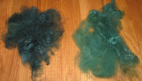
At this point, I decided to go with my intuition and try a combination of cyan, blue and brown colors at a 2% strength. The color I came up with was quite close, but most definitely too blue. My next attempt was using the same base colors but adding some yellow to make it look more green. The color that I came up with was then too green. Here are the two sample colors:

Two color samples
On a whim, I thought that if one was too blue and the other was too green, I might try to blend them together and see what came out. This is when I realized that part of my problem was that the colors I had produced were at a 2% strength, but the original roving was at a 1% strength and therefore was lighter than what I had created. I thought the best solution was to take the new color and blend it with some of the plain undyed alpaca to dilute the color and give it a heathered effect much like the original roving I was trying to match.
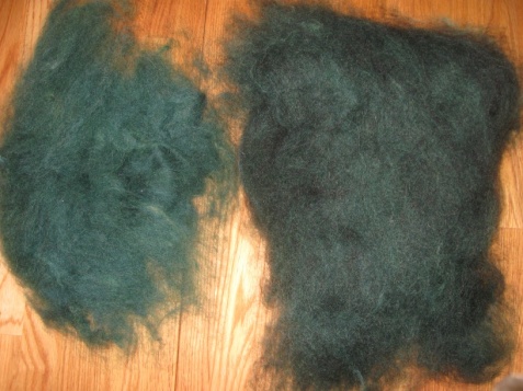
When I did this, it because obvious that even at a 1% strength, my color was very close to the roving I was trying to match, but was much too bright. The solution that came to mind was to deepen the color blend by adding black to dull down the brightness. The photo below shows the two mixed colors on the left and the same colors with black added on the right:

Blended colors
It’s very interesting how different the same color will look when black is added to it. So now I had what I thought was the correct color, except that it was twice as strong as the color I actually needed. You will notice that the color on the right side of the above photo looks very different than the photo of the sage-green roving I’m trying to match. The last phase of the project was to blend the darker color with just enough undyed alpaca to make the colors match. As I found out, this also isn’t as easy as I thought. When I added 50% undyed alpaca and 50% colored alpaca, the final product turned out much too light. I had to then add more of the dark color to get the effect I needed.
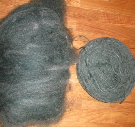
Finally, after much experimentation and not a little frustration, I came up with the following:

Matching color
It’s pretty close and looks better in person than in the photo. I think it will fit the bill quite nicely. I’m now quite terrified to try to match the mint-green lopi, but I’m hoping the process will go smoother there. Overall, this was much more involved than I had anticipated (but isn’t everything?), but I feel I learned a lot and have more confidence in my intuition leading me in the right direction.